


After a gruesome first week, it's finally here 🥲🥳🤩.
The week started as a normal week with lots of expectations and lots of considerations too. We had just concluded our four (4) weeks SideHustle internship and we were thrust into the bootcamp to gain real-world experience (we were pretty nervous), but here we are, done with week one and optimistic about week two.
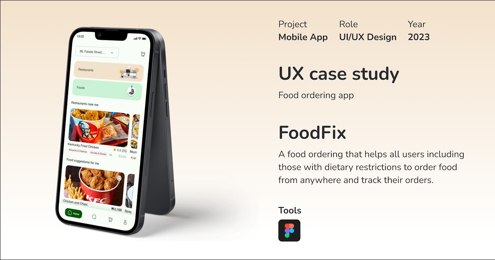
Our task was to carry out a UX case study on a food delivery app using the design process, and boy did we overshoot - we went ahead and created a new brand, but we stuck to it and we hope you enjoy reading this.
The FoodFix case study was undertaken by Product Design Team 6 of the SideHustle Bootcamp 7.0. with backings from the Product Management Teams 6 and 8, they were wonderful and we enjoyed working with them, we just hope they did as well 😉.
FoodFix is a food ordering app designed to provide a seamless and intuitive user experience to customers. Our goal is to create an easy-to-use interface that allows customers to quickly find their desired meals and place an order.
The members of the team include:
Abiodun Olamide - https://www.linkedin.com/in/abiodunwisdom
George Christian - https://www.linkedin.com/in/christian-george-c-a-18236010b
Lawson Emmanuel - https://www.linkedin.com/in/emmanuel-lawson-9053a2269
Oligbinde Anu - https://www.linkedin.com/in/anuoluwapo-oligbinde-ba9077167/
Watson Miracle - https://www.linkedin.com/in/miracle-watson-1b9a2924a/
Jonah Anthea (Asst Lead) - https://www.linkedin.com/in/anthea-jonah-5714b1220
Olasupo Boluwatife (Lead) - https://www.linkedin.com/in/boluwatifeolasupo
Truthfully, it was a wonderful experience. Being paired with two product management teams caused a bit of confusion and delay in our work at the start but we pulled through. We held our first meeting two days before task submission and could not agree on certain things (project managers' trouble 😡😤😂). After deliberation, we combined our research and found overlapping areas, only needing to include the features the other teams neglected 😂.
The Design Process
We started by conducting user research to understand the needs and pain points of our target audience. We conducted a survey using Google Forms to gather information on users' expectations and experience of food apps. Our research revealed that users experienced the “what I ordered vs what I got” problem and wanted an app that allowed them to customise and track their orders, and pay via different methods.


Figures: User persona
After research, we developed personas and wireframes, with information gathered to create a basic layout of the app's features and functionality. While we are still on the wireframes, we have created some high-fidelity mockups to show the visual design and layout of the app. We have sent the wireframes to the product managers by the way 😉.
We are focused on creating a clean and minimalist design that would allow users to easily navigate the app. We also made sure that the app had large, high-quality images of the food items to entice customers to place an order.
Testing
Once we finish the design, we would conduct usability testing with a group of target users. We will give them specific tasks to perform, such as placing an order, customising their order, and navigating the app. We will ask them to share their feedback on the app's usability, design, and overall experience.
The feedback we receive from users will be incorporated into the final design, making necessary changes to improve the app's usability and design.
Implementation
The final design of the app may include the following features:
Easy-to-use interface: A simple and easy-to-use interface that allows users to navigate the app with ease.
Variety of food options: The app would offer a wide variety of food options, including vegetarian, vegan, and gluten-free options.
Customisable orders: The app would allow users to customise their orders, such as choosing toppings, sauces, and sides.
High-quality images: We would include high-quality images of food items to help customers visualise what they are ordering.
Payment options: The app would offer multiple payment options, including credit/debit cards, bank transfers/USSD, digital wallets, and payment on delivery.
Order tracking: The app would allow users to track their orders in real time.
Conclusion
In conclusion, the UX case study for the food ordering app highlights the importance of user research, design, testing, and implementation. By understanding user needs and designing an app that is easy to use, visually appealing, and functional, we would create an app that meets the needs of our target audience. The final product is an app that provides an excellent user experience, resulting in higher customer satisfaction and engagement.